New search results in Google?
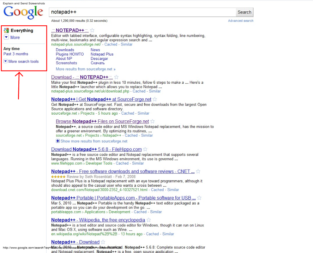
I just entered a search query for Notepad++ in Google Chrome, and the results page looked slightly different from what I’m used to:


Most notably, the left hand side is much cleaner. Clicking on the drop-down below “Everything” will show you the different categories (Images, Videos, etc.). The Search tools option lets you choose between “Any Time” and “Last 3 months”, and expanding it will show you a new list of options:
- Limit to a time period
- Social graph results
- Visited or not
- Display of results
- Standard results
I’m still trying to get used to it, but it looks like the result page is in line with Google’s minimalistic philosophy.